12 Best Wedding Invitation Fonts
Designing invitation cards is one of the most important steps in your wedding preparations. A font is a significant element of a wedding invite. There’re no strict rules for picking wedding invitation fonts, but looking for the right typeface it’s better to follow some common bits of advice. First of all, the print type must be legible. Secondly, make sure that your font looks good in italic or bold if you plan on using them. And finally, the chosen font should match your wedding theme. Here’s a selection of the best wedding invitation fonts for you to pick.
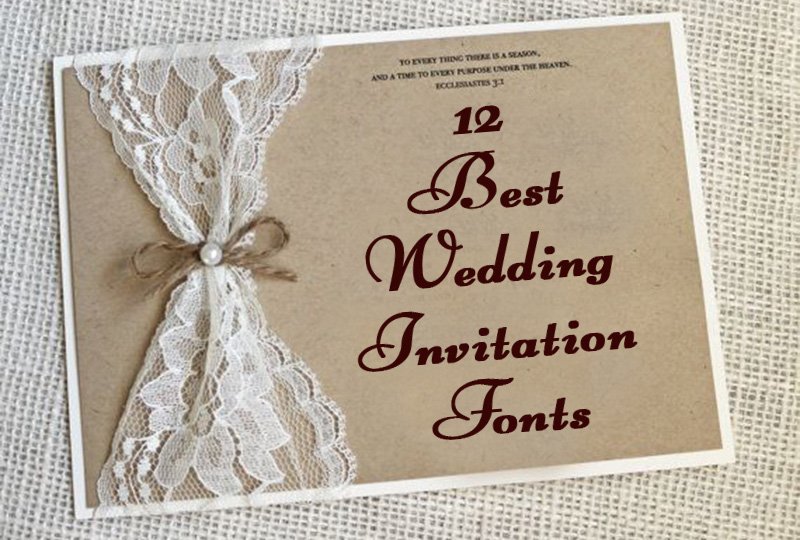
Sail
This font totally suits romantic wedding invitation cards. Sail looks perfect by itself, so there’s no need to pair it with other print types. Its windy capitals and elegant small letters are easy to read and make the font ideal for large texts. Sail can be used both in laconic and complicated designs.
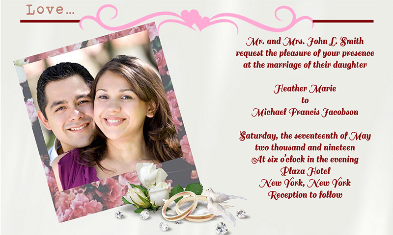
Parisienne
Parisienne falls into the category of casual scripts and it’s certainly one of the best wedding invitation fonts. This typestyle looks classic because of the connection, but at the same time a little bounce and designed unevenness give it some free spirit and lightness. Want a sweet invite card? Opt for soft colors and the Parisienne typeface.
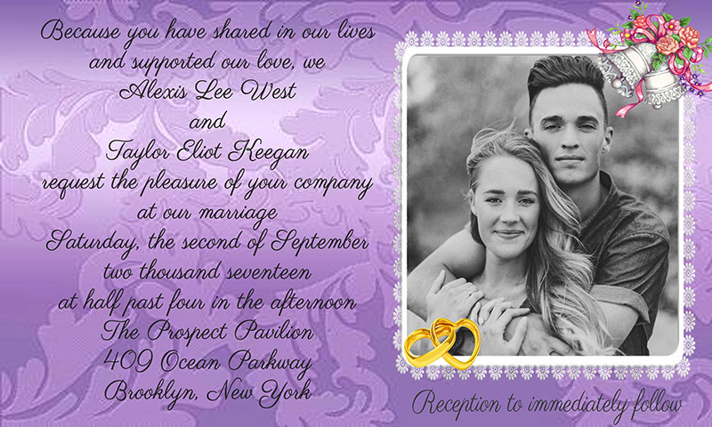
Gabriola
Looking for a font that perfectly combines legibility and playfulness? Then consider Gabriola, you will love it. Originally designed as a display font, Gabriola is good for large text passages. If your wedding invitations contain plenty of information, choose this print type – not a single word will be missed.
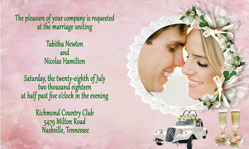
Poor Richard
Poor Richard is a standard Microsoft font with a touch of retro-chic. Both upper- and lower cases are easy to read and fit in any wedding invitation card style. You can easily pair it with a typeface that imitates hand writing. Play with combinations. For instance, the Poor Richard printing type looks awesome together with Edwardian Script ITC, doesn’t it?
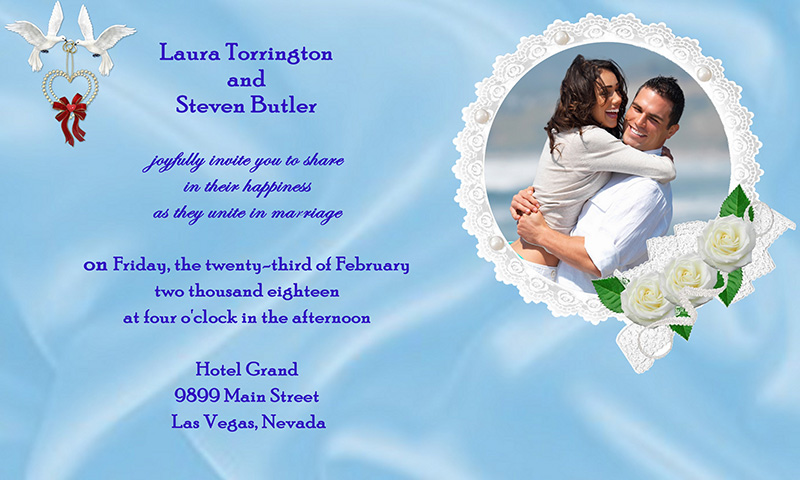
Cursive Standard
Most brides tend to pick connected handwriting typefaces when designing their invitation cards, so it’s no surprise that the Cursive Standard font is one of the most popular and best wedding invitation fonts nowadays. The text written in Cursive Standard is pretty to look at, just make sure that the card is not overcrowded with wording so your guests can read it easily.
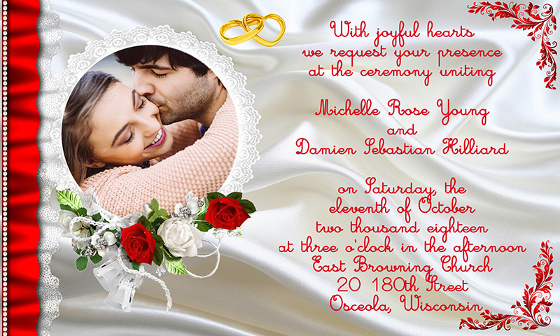
Fontleroy Brown
As for me, I think that Fontleroy Brown is an ideal font for a minimalist design of wedding invites. Despite those delicate flourishes, the Fontleroy Brown text looks rather laconic. However, the look of your wedding invitation card in print depends a lot on what paper type you choose, and it can differ from the image on your PC screen, so you’d better print one card to view if it’s what you expect to get.
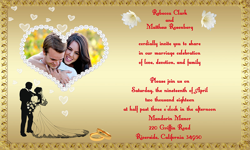
Salamander Script
Salamander Script as one of the best wedding invitation fonts is definitely worth your attention. Even at a fleet glance everyone will know that it’s a wedding wording they are about to read. Slightly playful, elegant and well legible, the Salamander Script typeface will make your wedding invitation cards gorgeous. Just find a good color combination for the background and the text.
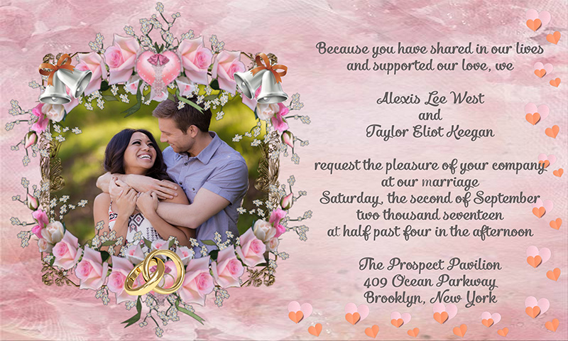
Matchbook Regular
Another standard typeface of Windows that suits wedding invitations is Matchbook Regular. It’s a serif font with extended forms. If you choose a quiet style for your invites, look closer at Matchbook Regular. Originally created for headlines and subheadings, this print type is sharp and perfectly readable, and can be used in large paragraphs.
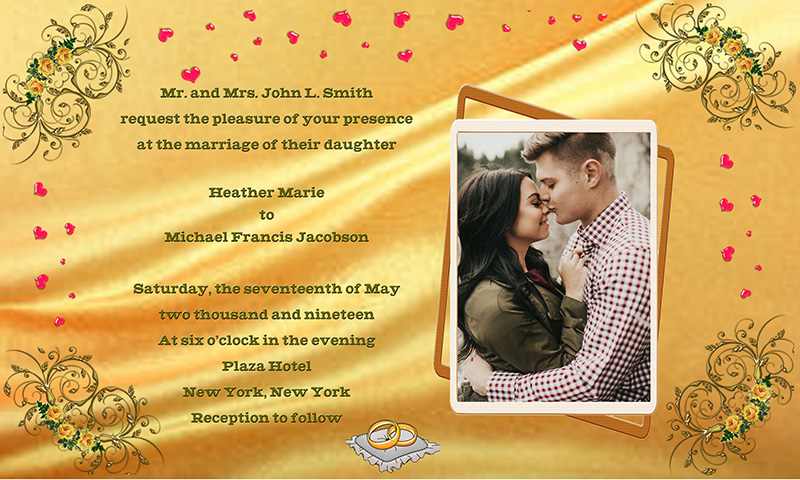
Champagne & Limousines
Seeking a compromise between serious and funny? Consider the Champagne & Limousines typeface. Even its name says that it’s all about a special holiday spirit and belongs to a family of the best wedding invitation fonts. Rounded letters of Champagne & Limousines are a bit higher than the other ones and that boosts the originality of this font.
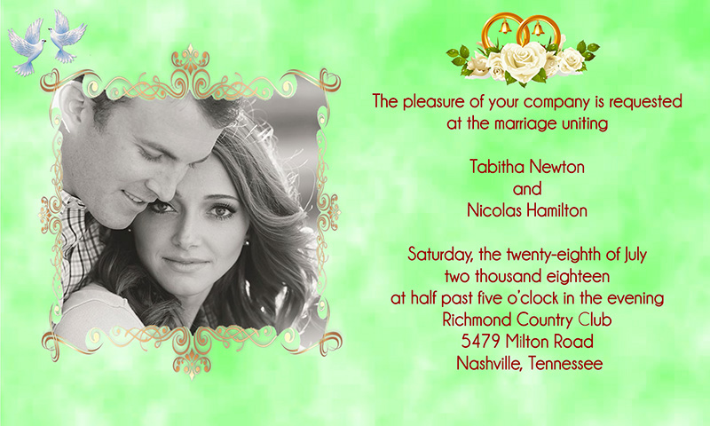
Arellion
Hand-drawn by a designer, Arellion is an extraordinary, elegant and highly attractive script typeface. The tiny pearls in every character contribute to the uniqueness of the font. Nevertheless, I’d advise you to experiment with different color schemes in order to find the best combination and not to waste the original feature of the Arellion typestyle.
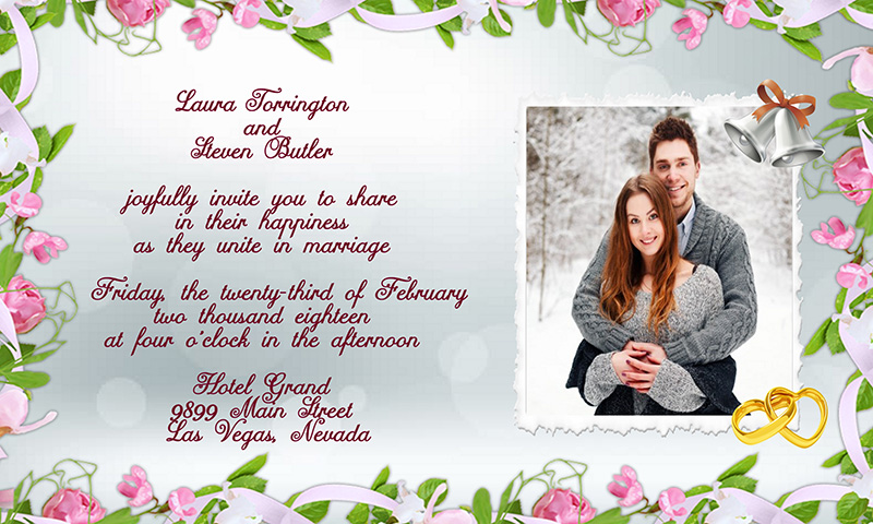
Good Vibes Pro
Still searching for your best wedding invitation font? Look at this invite! This simple yet stylish typeface is called Good Vibes Pro and you will feel that wedding romance is in the air. It’s a gracefully flowing joint script that fits in various invitation designs.
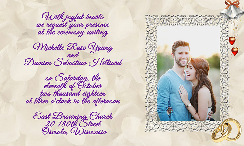
Majestic
Majestic is one of my favorite fonts. It’s an ideal combination of classic elegance and chic vintage. The typeface looks like a separate script. The Majestic characters are pleasant to look at and easy to read. Like the wedding invitation card below? Then try using the Majestic font in your invites.
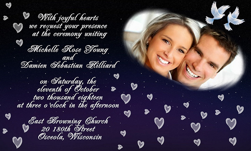
Make Your Ideal Wedding Invite
I hope you’ve got inspired by the list of the best wedding invitation fonts above and chosen a few to try yourself. Explore your designer abilities with Photo Collage Maker software: http://ams-collage.com and your friends will ask you to create a gorgeous invitation for the most significant day in their lives!


