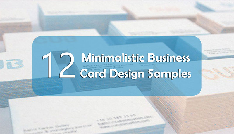
One of the most common and gravest mistakes you can make while creating your own business card is to overfill it with textual information and graphics. By doing this, you may think that you’ve got a fabulous design and tell your prospective clients everything they want to know, but in fact it’s just too much. Simple doesn’t mean bad or corny. A good business card will improve your professional image while a bad one will be seen as a failed attempt to look sophisticated. Keep on reading to learn the difference between these two.
