Wedding Photographer Business Cards
Shooting weddings is as much of a challenge as winning the customer’s trust and getting yourself to this wedding in the first place. In this competitive market you should become more than a person with an expensive camera, so you need powerful tools to promote your services. Coming in different forms and colors, wedding photographer’s business cards will surely help you showcase your talents, get the attention of prospective customers and seal your reputation of a professional. Check out this list of card examples and find the design that will be perfect for you!
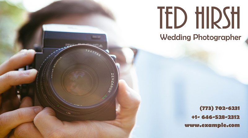
1. Classic Photography Business Card
As any other photographer, a wedding photo expert can use a classic design with an image of themselves behind a camera. That way you’ll support a professional outlook and still create a business card that catches an eye of a potential client. It seems like a good idea to slightly blur the background image to bring your contact information to the front. Using this easy trick you won’t steal attention from the contacts and make your calling card look more immersive.
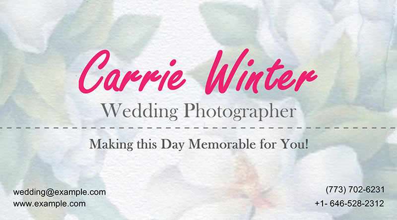
2. Business Card with Floral Background
Flowers are closely associated with all kinds of celebrations, and a wedding is no exception. If you’re thinking of the design of business cards for a wedding photographer, opt for some floral pattern. In this case, flowers will add a nice touch to an already sweet calling card. Depending on the sort of flowers you choose, you can send different messages. For example, roses show you’re keen on a traditional approach, while carnations suppose you’ll find beauty even in simple things.
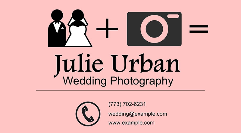
3. Iconic Wedding Business Card
Solving riddles isn’t the thing your customers expect when taking your wedding photography business card in the hands. However, you can still entertain them by combining easily recognized icons and pictograms in your card design. Take a look at this card, for example! It’s bright, vivid and absolutely unique in the way of presenting your contact information. Recreate this design yourself if you want your occupation to be obvious at first glance.
4. Geometric Business Card
If you’re a fan of sophisticated forms and intricate elements, you should definitely try making a geometric card. Among other business cards for a wedding photographer in this collection, this design is quite universal. It will show your clients that you have an eye for everything beautiful and know how to combine colors. What’s more, this hypnotizing pattern will make your business card a fine decoration in one’s wallet and a great sharing item.

5. One-Color Photographer Card
While pink is probably the most popular and (let’s face it) overused color for a wedding ceremony, it can still serve you well. My general advice is to think out of the box. Don’t use all possible rose-colored embellishments in your design – no one is too eager to see fifty shades of pink stuffed into a single business card. Thanks to its dashing text style, the design isn’t too sweet to bear and leaves an air of mystery about a photographer as potential clients will have to check out the website to learn more.

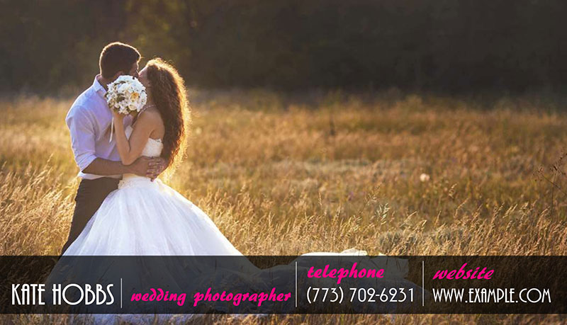
6. Business Card with a Portfolio Photo
One of the best ideas for a wedding photographer is to showcase their previous works to new clients who’ve just taken their card into the hands. Pick your favorite shot from your vast portfolio and use it as the background image of your wedding photography business cards. Make sure that it’s perfectly visible and doesn’t steal attention from your contact information. My advice is to add some base layer for text captions and place your contacts in the lower part of the card design.
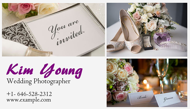
7. Photo Collage Business Card
As you’ve heard devil is in the details, so you need to carefully consider all the small elements of your calling card. It won’t win you any new clients if you grab the first photos from your collection and proudly put them on your business card. It’ll be a great idea to combine several images into a gorgeous photo collage. Just remember to keep up with the color scheme and style of the chosen pictures.
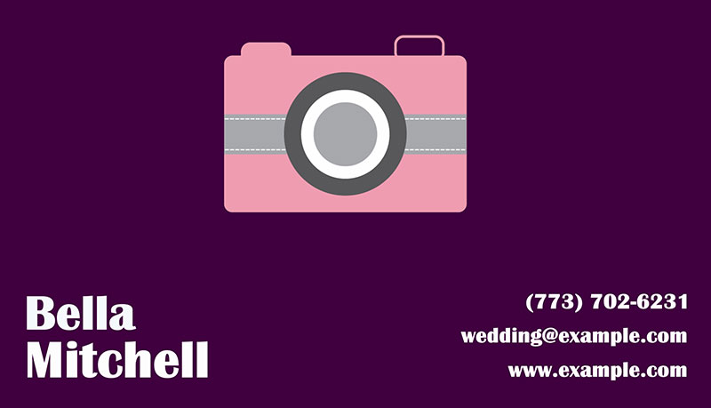
8. Minimalistic Business Card Design
Wedding photographer’s business cards don’t have to be overstuffed with details and images, sometimes it’s better to go for a minimalist approach. Here a stunning combination of purple tones and a simple icon depicting a camera work great together. The contact information is positioned on both sides of the card design, so the name of a photographer and their website address don’t clatter.
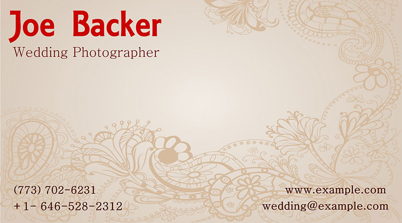
9. Vintage Business Card for a Photographer
A wedding ceremony is often associated with something soft and tender, so you can try making a touching effect with your business card. Your customers will definitely appreciate pastel colors and floral patterns combined into a nice design. Play with the font and style of your text captions to make your contacts more eye-catching. For example, here the red color is used for the photographer’s name to instantly draw the viewer’s attention.
10. Business Card with Original Text
Text can be the central part of business cards for a wedding photographer. That way you don’t have to think about which photo to choose or how to send it to the background so that your contacts are clearly seen. The trick is, though, to combine different fonts and text styles to create a professional and not too empty card design. I’d recommend picking one text caption and making it especially large, while the rest of them should complement this main title.

So how do you like the wedding photographer’s business cards I’ve gathered here for you? With http://business-card-maker.com, you can make a lasting impression on your clients by handing them customized business cards that you won’t get in a regular print shop. If you have more creative ideas on photography card designs, share them in the comments and we’ll mention them in the next post!


